
Building Flexible Components with Grid & Container Queries
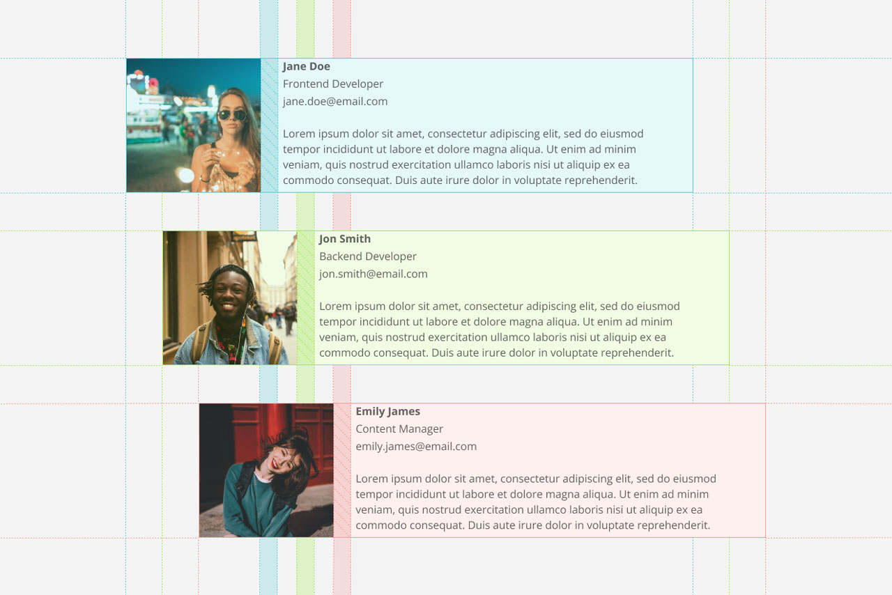
I built this component for the CMS at Goucher College. The component needed to be capable of handling any amount of content while maintaining a 1:3 image to text ratio. Using Grid and the new CSS Container Queries, this component adjusts its layout based on its own width and not the width of the viewport. Check out my Substack below where I go into more detail about how I built this component.